When picking the best printing for your packaging, knowing the difference between pantone and cmyk is key. Color matching is vital for your brand’s look and feel. Choosing the right color system is essential for consistent colors. For more on pantone and cmyk printing in packaging, check out this link.
Key Takeaways
- Color accuracy and consistency are vital in packaging design to maintain brand identity and recognition.
- Pantone and CMYK printing are two common printing methods used in packaging, each with its unique benefits and applications.
- Understanding the differences between pantone and cmyk printing in packaging is essential to choose the right color system for your packaging needs.
- Color matching in printing is a critical aspect of packaging design, and using the right color system can ensure accurate and consistent colors.
- Printing techniques in packaging, such as pantone and cmyk printing, can significantly impact the final product’s appearance and overall brand image.
- By considering factors like color requirements, number of colors, and budget, you can select the most suitable printing method for your packaging needs.
- Utilizing resources like physical color matching books from the Pantone Corporation can help ensure accurate color matching in your packaging design.
Introduction
Color is key in packaging design for brand recognition and professionalism. You want your packaging to catch eyes on store shelves and make a strong impression on customers. The pantone color system and cmyk color model are two main printing methods used in packaging. Knowing the differences between these methods is important for creating attractive and effective packaging.
Overview of the Importance of Color in Packaging
Color consistency builds trust and recognition. In packaging, color can stir emotions, send messages, and shape brand identity. With the rise in customized packaging, companies seek ways to ensure consistent and accurate colors. The pantone color system offers over 1,000 shades, providing a wide range of unique colors. The cmyk color model, using ink, helps save on ink costs.
Introduction to Pantone and CMYK as Common Printing Methods
Pantone and cmyk color models each have their own benefits and drawbacks. Pantone ensures identical colors every time, but it’s pricier and slower. CMYK printing might have slight color differences, but it’s cheaper and faster. For more on printing methods and materials, check out custom retail packaging services.
Here are some key differences between pantone and cmyk:
- Pantone offers a wider range of colors
- CMYK is more cost-effective and efficient
- Pantone achieves identical colors from print to print
- CMYK may result in slight color variations
What is Pantone Printing?
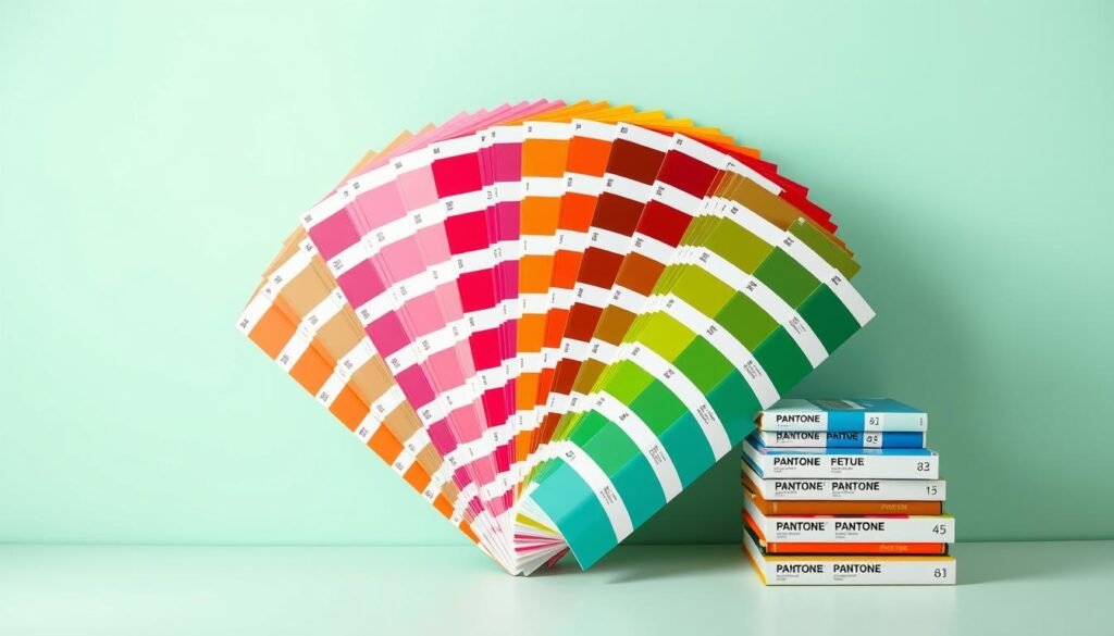
Pantone printing is a key method in the printing world, known for its exact color matching. The Pantone Matching System, or Pantone Color System, is a global color standard. It uses pre-mixed inks to create a wide range of colors, ensuring colors match everywhere.
This system has over 1000 shades, making color matching precise. In the printing world, getting colors right is critical. For more on Pantone and CMYK printing, check out this guide.
Here are some key features of the Pantone Matching System:
- Over 1000 shades for precise color matching
- Used in the printing industry for color accuracy
- Based on a set of pre-mixed inks

The Pantone Matching System has a long history in printing. It’s vital for color accuracy and consistency. Knowing about Pantone helps you make better printing choices and get the results you want.
What is CMYK Printing?
CMYK printing uses cyan, magenta, yellow, and black inks to make many colors. It’s based on the subtractive color process. This process absorbs some light and reflects others, creating rich, detailed images.
The subtractive color process mixes these four colors. By changing how much of each color is used, many hues and shades can be made. This is why the cmyk color model is great for printing that needs to be very accurate, like in packaging.
Some key benefits of the cmyk color model include:
- Ability to produce a wide range of colors
- High level of color accuracy
- Suitable for printing techniques such as photorealistic and multi-color imagery

The cmyk color model is versatile and widely used. It’s perfect for many printing techniques. Its ability to create a wide range of colors and its high accuracy make it a top choice for many uses.
| Color Model | Description |
|---|---|
| CMYK | Combines cyan, magenta, yellow, and black inks to create a wide range of colors |
Pantone vs. CMYK: Key Differences
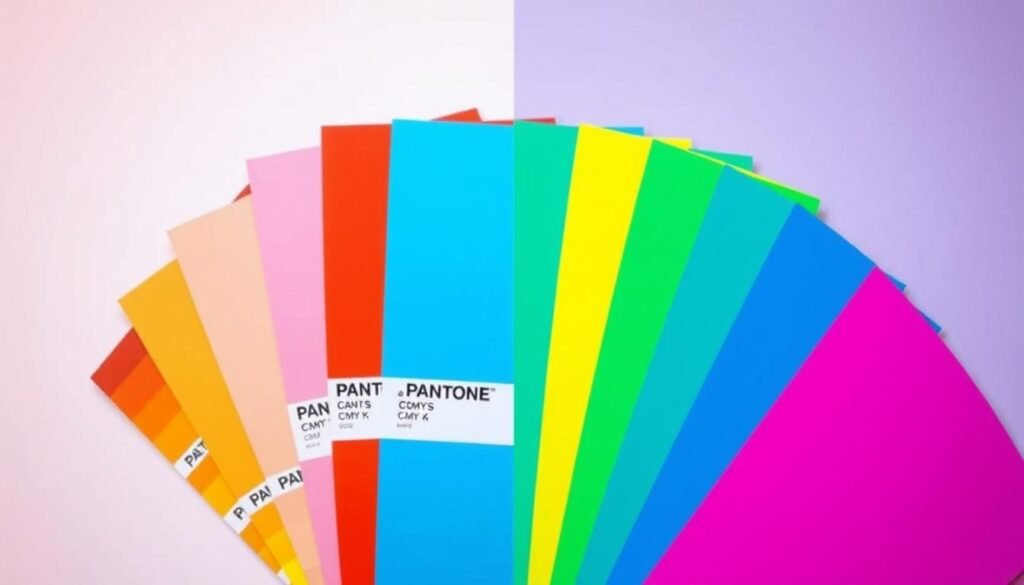
Pantone and CMYK printing differ in color accuracy. Pantone is known for its consistent colors, perfect for branding. CMYK printing, while variable, depends on the printer and paper quality.
Pantone can create a wide range of colors, including metallic and fluorescent ones. CMYK can’t match this. Color printing guides suggest Pantone for exact color matches.
Here are some key differences between Pantone and CMYK printing:
- Pantone offers more consistent and accurate color reproduction
- CMYK printing can be more variable due to printer, paper, and ink quality
- Pantone can produce a wider range of colors, including metallic and fluorescent hues

Pantone uses a spot color method for high-quality but expensive prints. CMYK uses a subtractive color model, leading to a 5-10% tonal difference. Knowing these differences helps choose the right printing method for your project.
When to Use Pantone in Packaging Design
In packaging design, using pantone is key for matching brand colors. Luxury packaging needs exact color matches to look high-end. The pantone system has over 1000 shades, making sure each color looks right on different materials.
Keeping brand colors the same is important for brand trust. Pantone helps make sure your brand’s colors look the same everywhere. For example, fancy brands use pantone to match their special color scheme.

Pantone is also great for packaging that needs exact colors, like cosmetics and fancy items. Here are some good things about using pantone in packaging design:
- Accurate color representation
- Consistent brand image
- Premium look and feel
Using pantone in packaging design means your brand’s colors will always look right. This is perfect for luxury or high-end products. Pantone helps make sure your packaging looks top-notch and consistent.
| Benefits | Description |
|---|---|
| Accurate color representation | Ensures that colors are accurately represented on various materials |
| Consistent brand image | Creates a cohesive and recognizable brand image |
| Premium look and feel | Conveys a high-end and luxurious image |
When to Use CMYK in Packaging Design
CMYK is perfect for products needing lots of colors, like in product photos and illustrations. It’s great for making eye-catching, colorful designs. For example, it can make darker colors on kraft substrates, which is useful for some designs.
Using CMYK in packaging design has many benefits. It’s great for creating detailed and dynamic images. Experts say it’s a well-known and used printing model, perfect for printing with three or more colors. Plus, it’s good for the environment because it uses less ink and gives accurate colors.
When choosing CMYK for packaging design, think about these points:
- Color variety: CMYK is best for products needing many colors.
- Design elements: CMYK is top for vibrant, colorful designs.
- Environmental impact: CMYK printing is eco-friendly.

For more on packaging design, check out the ultimate guide to product packaging. It talks about picking the right packaging materials, types, and printing methods for your business.
| Printing Method | Color Model | Benefits |
|---|---|---|
| CMYK | 4-color process | Vibrant, color-rich designs; environmentally friendly |
| Pantone | Spot color | Exact color match; consistent color reproduction |
Combining Pantone and CMYK Printing for Packaging
Getting the best results in packaging design is key for brands to stand out. Mixing Pantone and CMYK printing can help achieve this. Pantone is used for logos and colors, while CMYK covers the rest of the design. This way, brands can show their true colors consistently.
Using Pantone and CMYK together in packaging design has many advantages. Pantone makes sure colors stay the same, while CMYK offers more colors. This mix lets brands use Pantone for important parts and CMYK for the rest, leading to the best results.
- Consistent color reproduction: Pantone keeps colors the same, and CMYK adds more options.
- Optimal results: This mix gives the best of both worlds, with Pantone for key elements and CMYK for the rest.
- Increased design flexibility: It lets designers pick the best color system for each part of the design.
By mixing Pantone and CMYK printing, companies can make packaging that looks great and matches their brand. This can boost brand recognition and loyalty, helping businesses grow.
Choosing the Right Color System for Your Packaging Needs
Choosing the right color system is key for your packaging design. It ensures your brand’s identity shines through. With many color systems out there, picking the right one can be tough. Think about color accuracy, consistency, and cost when making your choice.
Consider what you need from your packaging. The type of materials and the look you want are important. This will help you pick the best color system for your needs.
For example, if exact color matching is a must, Pantone might be the way to go. But if you need to print many colors, CMYK could be better. Here are some things to think about when picking a color system:
- Color accuracy: How important is it for your brand’s colors to be precisely matched?
- Consistency: Will your packaging be printed on various materials or substrates?
- Cost: What is your budget for printing and packaging design?
By thinking about these points and what you need, you can find the best color system. Whether you pick Pantone or CMYK, make sure your brand looks the same on all packaging.
Color Accuracy in Pantone and CMYK Printing
Color accuracy is key in packaging design. The right colors can make your product pop, while wrong ones can harm its image. Both Pantone and CMYK printing have their own color accuracy levels. Knowing how to get accurate colors in each is vital.
Pantone printing uses a standard color matching system. It has over 1000 shades for consistent color across different printers and projects. CMYK printing, on the other hand, uses Cyan, Magenta, Yellow, and Black. It’s cheaper but less accurate, with a 5-10% difference between screen and print.
To get accurate colors in both Pantone and CMYK, consider the material and printing method. For example, printing on kraft material can make colors appear darker and more “brown” than on white. CMYK printing works best on white substrates, but colors on kraft can look different.
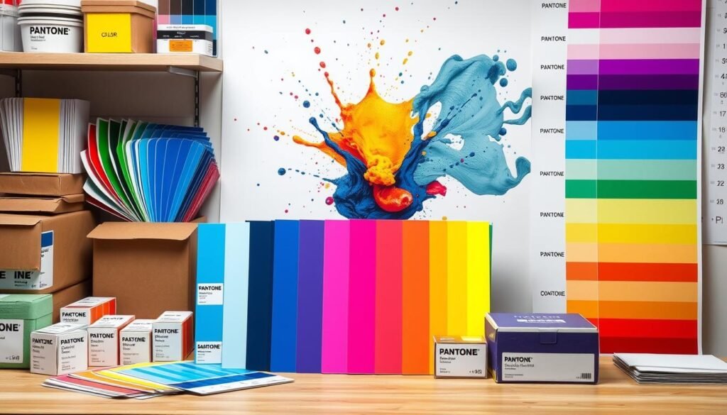
Here are some tips for color accuracy in Pantone and CMYK printing:* Use Pantone color matching books to pick colors on paper, not digital screens.* Think about the material and printing method when picking colors.* Ask for physical proofs or drawdowns for accurate color matching, like on kraft substrates.* Know CMYK printing’s limits, like color variation and how material affects color.
New Advancements in Pantone and CMYK Printing
The world of packaging design is always changing. New color technology is making it easier to get colors right. Tools like the CMYK to Pantone Converter help designers work with both systems more easily.
These new tools bring many benefits. They improve color accuracy and make design work more efficient. For instance, digital printing is becoming more popular. It’s seen as a big change for the future, with 73% of converters thinking it’s transformative.
Here are some ways these advancements are changing packaging design:
- Improved color accuracy and consistency
- Increased efficiency and reduced lead times
- Enhanced design capabilities with digital printing technology
- Sustainable and eco-friendly printing options with cmyk printing
As the packaging design world keeps evolving, it’s key to keep up with new pantone and cmyk printing tech. Using these advancements, companies can make unique and effective packaging. This helps them stand out in a busy market.
| Printing Method | Color Accuracy | Cost | Environmental Impact |
|---|---|---|---|
| Pantone | High | Higher | Medium |
| CMYK | Medium | Lower | Low |
Conclusion: Recap of the Key Differences between Pantone and CMYK Printing
Understanding the differences between Pantone and CMYK printing is key for top-notch packaging designs.Pantone gives unmatched color accuracy and consistency. It’s the top pick for branding and detailed designs. CMYK printing, on the other hand, creates bright, rich colors and is cheaper for big print jobs.
Choosing the right color system depends on your needs. Think about color accuracy, design complexity, and budget. Pantone is best for exact color matches. CMYK works well when slight color differences are okay.
The packaging design world is growing, with new tech in Pantone and CMYK printing. We see better color accuracy and eco-friendly inks. These changes are making luxury and custom packaging even better. Check out these updates and contact our team for help picking the best color system for your design.


