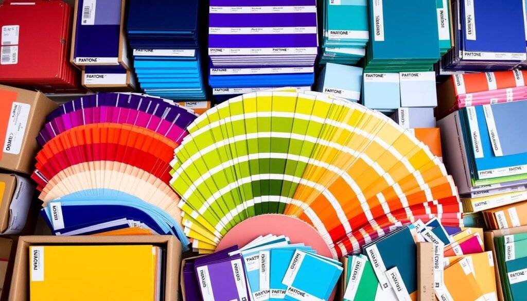
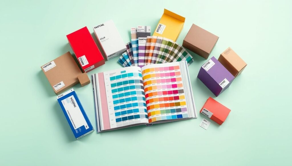
Color is key in packaging design, shaping how customers see your brand. A pantone swatch is a must for accurate colors. The Pantone Matching System (PMS) offers over 1000 colors for precise matching. This article will dive into the importance of pantone color charts and their use in packaging design.
A pantone swatch keeps colors consistent across various materials and printing methods. It prevents color shifts seen in CMYK printing. This is critical for branding, as mismatched colors can harm your brand’s image.
Choosing the right colors for your packaging is easier with a pantone color chart. Pantone swatches ensure your packaging colors are consistent and accurate. This is essential for a strong brand identity.
Key Takeaways
- Using a pantone swatch for packaging print ensures accurate color matching.
- Pantone color chart provides over 1000 distinct colors for packaging design colors.
- Color consistency is key for branding and can be achieved with pantone swatches.
- Pantone swatches help avoid color deviations that occur with CMYK printing.
- Consistent colors give your packaging a professional and polished look.
- Pantone swatches are essential for maintaining color consistency across different materials and printing methods.
- Using a pantone swatch for packaging print can help you build a strong brand identity.
Introduction
Color is key in packaging design, shaping how customers see your brand. To get your colors right every time, you need a trusted color matching system. That’s where Pantone color matching comes in. It’s a color guide that keeps colors the same across different materials and printing ways.
Using Pantone color matching means you get print color accuracy. This way, your brand’s look stays true to itself, every time.
The Pantone color system has over 5,000 colors. This gives designers and printers lots of choices. With the Pantone Matching System (PMS), you can pick exact colors for your packaging. This ensures your brand’s colors stay the same, no matter where or how it’s printed.
- Consistent colors across different materials and printing methods
- Accurate representation of brand identity
- Wide range of color options (over 5,000 distinct colors)
- Standardized color guide for designers and printers
Using Pantone color matching makes your packaging look professional and polished. This can help build trust with your customers. Next, we’ll look at what a Pantone swatch is and how it helps with print color accuracy.
What is a Pantone Swatch?
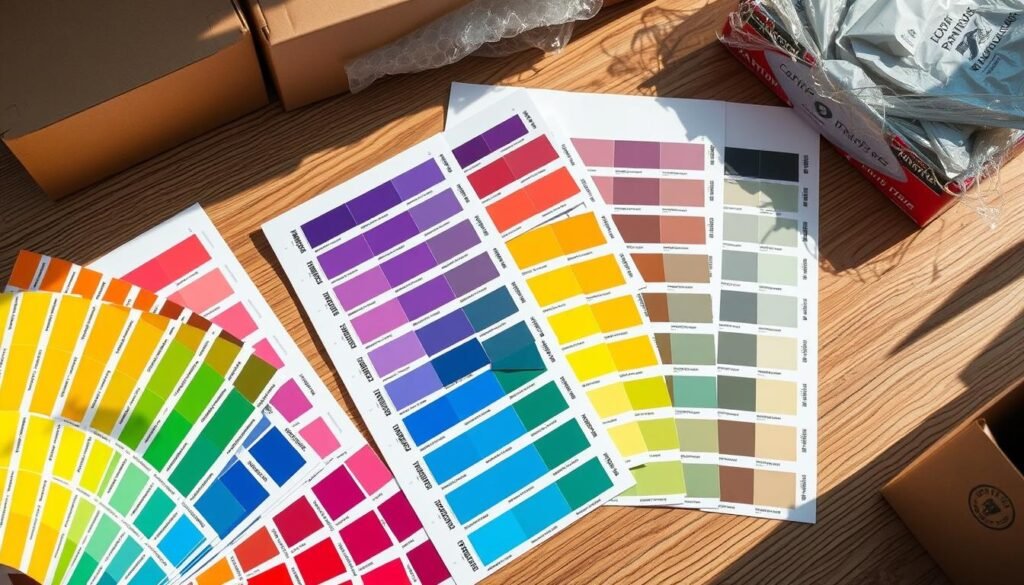
A Pantone swatch is a color guide that helps designers and printers keep colors the same. It uses the Pantone Matching System (PMS) to match colors in packaging print. This ensures your packaging design looks right, no matter where or how it’s printed.
The Pantone color system is key in the packaging world. It keeps colors accurate and the same. For printing swatch colors, Pantone swatches are vital. They give a standard reference for matching colors. This is key for packaging color selection, making sure the final product looks good and matches the brand.
Here are some key benefits of using Pantone swatches:
- Accurate color matching
- Consistent colors across different materials and printing methods
- Wide range of colors to choose from
Using Pantone swatches makes sure your packaging looks professional and matches your brand. Whether it’s on paper, cardboard, or other materials, Pantone swatches help match colors. This ensures your packaging looks as you want it to.

Why Pantone Swatches Matter for Packaging Print
Consistent color is key in packaging. It shapes how people see your brand. Up to 90% of first impressions about products come from color. So, getting it right is vital.
Pantone swatches help make sure the same color is printed every time. This is true no matter the material or printing method. It prevents mistakes that could make your packaging look bad or uneven.
Brands that want a consistent look across products and marketing materials need Pantone swatches. For example, Coca-Cola’s red has built trust and loyalty for decades. The Pantone Matching System (PMS) is a global standard for color consistency in print. It’s a must for packaging design colors and ensuring print color accuracy.
To learn more about spot color and CMYK printing for packaging and print, visit this resource. It helps you choose the best printing method for your projects.
Some key benefits of using Pantone swatches include:
- Consistent color across different materials and printing methods
- Accurate color matching with the Pantone Color Bridge Guide
- Eco-friendly ink options to address consumer demand for sustainability

Using Pantone swatches ensures your packaging colors are accurate and consistent. This is essential for a strong brand identity and keeping customer trust.
Choosing the Right Pantone Color for Your Packaging
The right color for packaging can change how people see your brand. Use a pantone color chart to pick the perfect shade. This is key for packaging color selection, as it helps your brand stand out.
A pantone swatch guide is a great tool for matching colors accurately. It helps you choose a color that fits your brand and appeals to your audience. For example, picking a color that matches your logo and website can create a unified brand image.
According to the ultimate guide to product packaging, the right Pantone color is vital for a strong brand. Consider these points:
- Material: The material affects how colors look. For instance, colors differ on paper versus plastic.
- Brand identity: Your packaging should match your logo, website, and other materials for a cohesive look.
- Target audience: Think about what your audience likes and expects when picking a color.

By thinking about these points and using a pantone swatch guide, you can pick a Pantone color that boosts your brand’s image. Make sure your packaging color is consistent with all your marketing to build a strong brand identity.
Steps to Use a Pantone Swatch in Your Packaging Print Process
To get the right colors in your packaging, using a pantone swatch is key. You need to pick a Pantone color with your designer that matches your brand. Make sure your designer includes Pantone codes in the design files. Also, tell the printing company the Pantone color clearly to avoid mistakes.
- Work with your designer to select a Pantone color that aligns with your brand identity and packaging design
- Ensure that your designer provides Pantone codes in the design files for the printer, to guarantee print color accuracy
- Communicate the Pantone color clearly to the printing company to avoid any confusion during production, and to ensure pantone color matching
By following these steps, you can make sure your packaging looks great. This is important for keeping your brand looking professional.

Common Pitfalls to Avoid
When using the pantone color system for packaging, it’s key to know common mistakes. These can mess up the printing swatch colors. One big issue is thinking pantone colors will always match perfectly. This can cause problems in the final product.
Pitfalls in pantone color system
- Material and finish: Pantone colors can look different on various materials or finishes, such as coated or uncoated papers, or silicone materials.
- Color variation: Using the same pantone color formula can result in color variation based on the material, and heat fixing processes can change the tone of pantone colors.
To dodge these issues, it’s vital to give your printer the exact pantone code. Also, think about the material and finish of your packaging when picking printing swatch colors. You can check out custom retail packaging sites for more on packaging color selection and the pantone color system. Knowing these common pitfalls helps make sure your packaging looks great and consistent. This is important for gaining your customers’ trust.
How Pantone Swatches Improve the Quality of Your Packaging Design
Using a pantone swatch for packaging print can make your packaging look much better. It ensures your colors are consistent, giving your packaging a professional feel. This can help build trust with your customers.
Pantone swatches help your design stay true to your vision, from start to finish. They prevent color surprises that can harm your brand’s image. Many top brands use them to keep their packaging looking sharp and reliable.
Some benefits of using pantone swatches for packaging design include:
- Improved print color accuracy
- Consistent packaging design colors
- Enhanced brand recognition
- Reduced color errors and rework
By adding pantone swatches to your design process, your packaging will look professional and consistent. This can help build trust with your customers and boost your business.
Conclusion
Starting your packaging design journey? Remember, Pantone swatches are key. They help your brand’s colors look the same everywhere. This ensures your brand’s look is consistent and clear.
Color accuracy is critical for a professional look. Choose the right Pantone swatches for your packaging. Work with your designer and printer to get it just right. This is how top brands keep their look consistent.
Want packaging that grabs attention and boosts your brand? Contact our team of experts. We focus on color accuracy and keeping your brand consistent. Let’s make your packaging unforgettable together.


